el Hueco
Starting a food truck from the ground up is no joke; a fact that became abundantly clear to my wife and I when we decided to kick off a new business. You, of course, need to set up all the usual infrastructure elements, from creating the menu to setting up payroll; now, put it on wheels. This thread is focused solely on the design side.
My father is Peruvian, so I grew up on anticuchos, lomo, papa rellena... all the good stuff. Peru is known for their cuisine - it's exciting, unique, and an intersection point where many cultures meet. So naturally, we wanted to bring Peruvian cuisine to the San Diego area.
Name
When you link up with friends in Lima, one may lean over and tell you they've found a great new underground food spot. There's a slang term for this word-of-mouth culinary gem, "el hueco."
Logo
I wanted to hit on two main messages for the logo - Peru and word-of-mouth - in that order.
The llama is the quintessential animal for Peru. I tried other things in the concept phase (pans, utensils, flowers...) but always returned to the llama. It reminded me of Peru more than any other option.
The slang, underground, and word-of-mouth elements were essential. So I decided to use negative space for a speech bubble to hint at the idea of communication. I thought it was fitting to be a bit hidden, just like the Peruvian spots it represents.
Uniforms
We then took the logo and word mark designs and created some shirts for our employees.
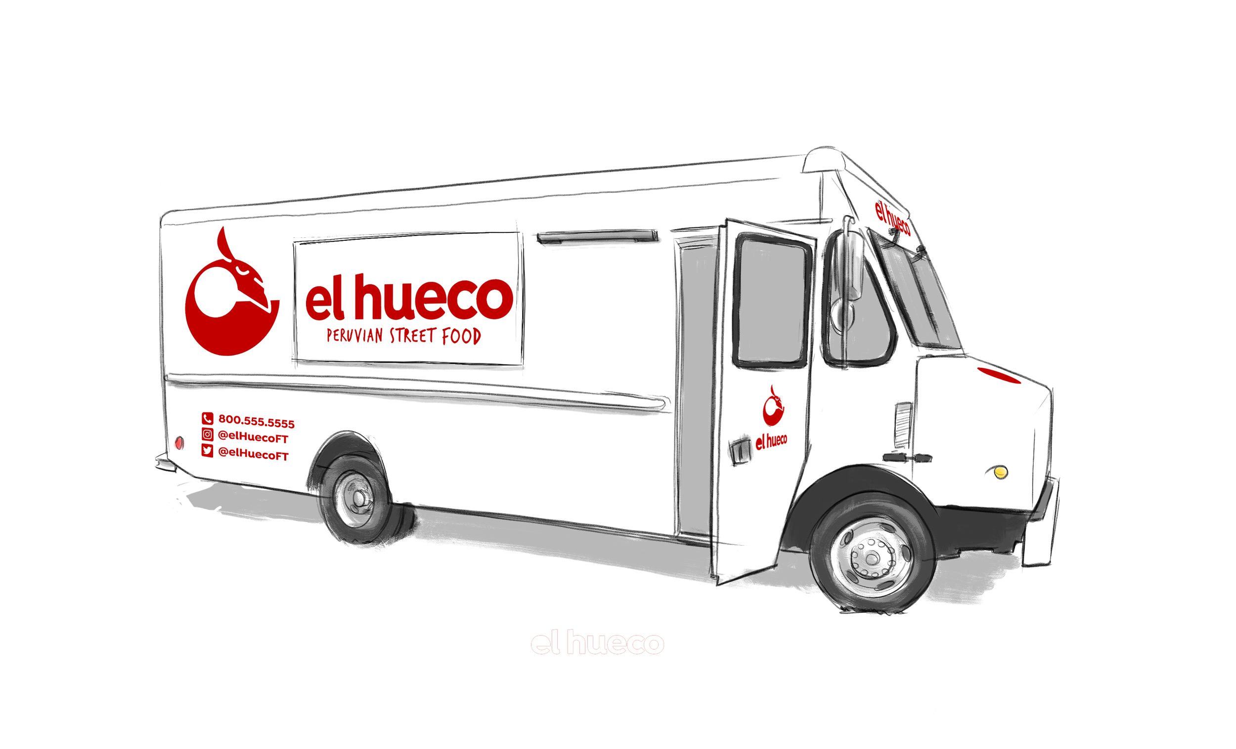
Truck Wrap
The wrap design is your entire visual identity. Often times you're out with a group of other food trucks at a festival or lining the street at a street fair. It's important to make a statement. We wanted something with a minimal color palette, bold graphics, and earthy elements (wood, plants...).
Some early concepts…
The concept
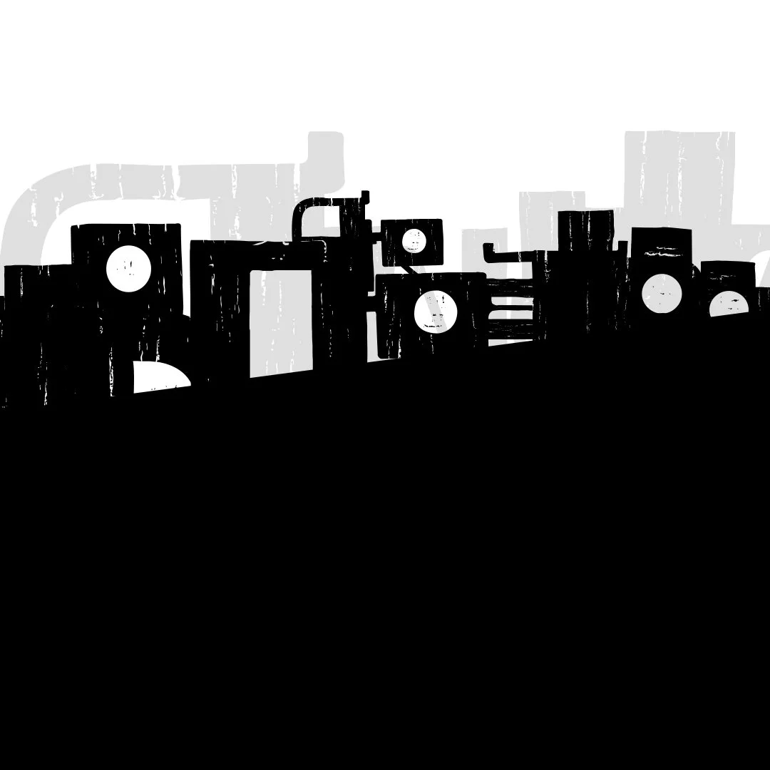
The Andes mountains cut through Peru and are another symbol of the country and culture. Dynamic peaks and valleys are visually appealing and bring energy. Small towns are perched on these steep slopes, and I thought they were essential and needed representation. After all, food is at the heart of these cultures. I built towns by stacking menu item names rendered in a font by a South American designer (“Basurai”). Some of the letters are literally underground.
Window layout
I wanted to pull your eye to where you order your food. The cashier stands in a specific spot where he/she can take the order, talk to the chefs, and hand out the food. I pulled the eye in by angling the mountains to create a valley in that spot. Notice the lines of action and bold contrasts. .
Also, we set up a menu and crates made of stained wood. The warm wood colors and green plants helped draw the eye and welcome hungry guests.
Final
We hit the streets in 2019, turning heads with this bold design.
Menu
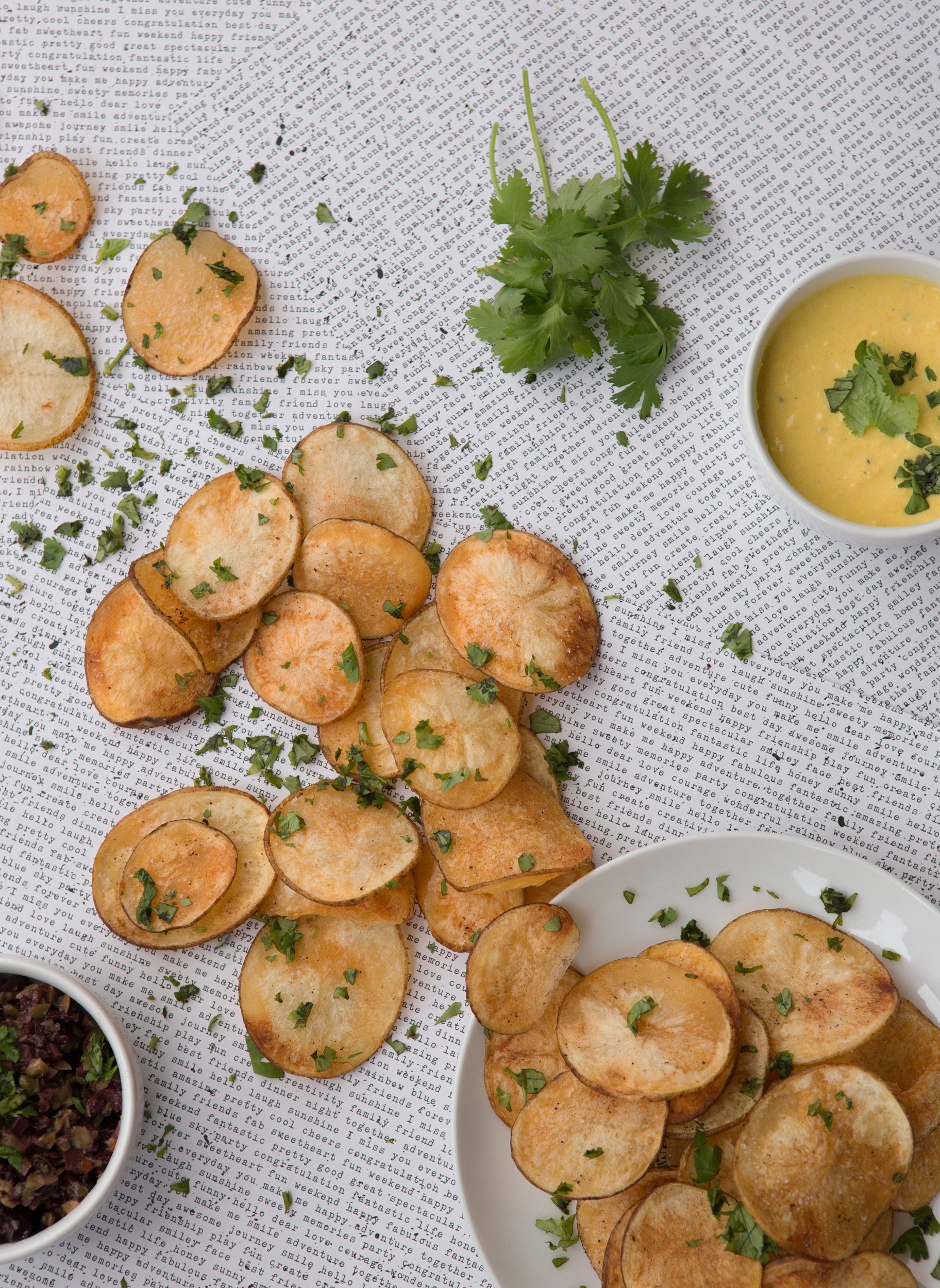
Just a taste of what we're serving. (Photos by Brittany Seely)
Packaging
We wanted our branding to feel hand-made, so we used stamps to mark the products. We are also big believers in leaving things better than you found them, so we went with eco-friendly materials, so everything was either biodegradable or recyclable.
My Roles
Co-owner
Brand strategist
Art director
Illustrator


